Why Softer Coffee Corner Choices
Often Work Better in Real Kitchens There is a certain kind of coffee corner that photographs beautifully and then quietly loses the battle with morning life. The cup hooks are perfectly lined up. The tray is crisp and minimal.
The canister labels are elegant enough to make you feel slightly underdressed. And yet, by day four, the spoon has wandered, the grounds are spilling, and the whole corner starts asking for more tidying than brewing. That is where softer visual choices come in.
In real kitchens, especially the ones that do more than one job, softness often turns out to be a practical decision as much as an aesthetic one. Rounded edges, muted finishes, matte surfaces, warmer tones, and a little visual breathing room can make a coffee corner feel calmer to use and easier to keep up. The effect is subtle, but the difference shows up every day.
The visual temperature of a kitchen matters
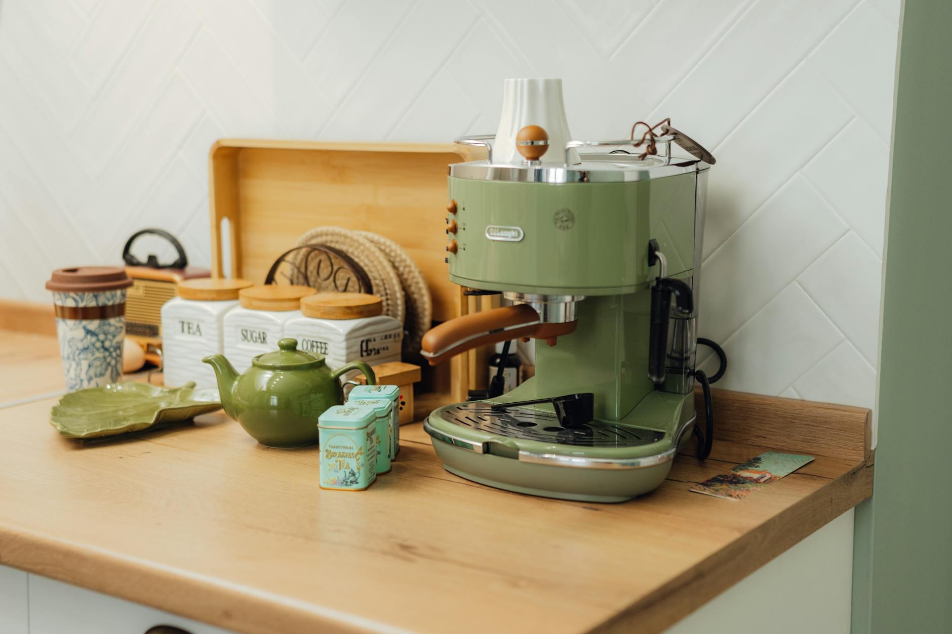
A coffee corner sits in a very active part of the home. It gets used early, often before anyone is fully awake. It collects a mix of small items: mugs, filters, spoons, beans, tea bags, napkins, maybe a grinder, maybe sugar, maybe nothing at all except clutter that seems to arrive on its own.
In that setting, hard visual contrast can make the area feel busier than it is. Bright white containers beside shiny black appliances, highly reflective metal, and sharp-edged accessories can all read as “more stuff” to the eye. Softer choices tend to blend rather than announce themselves.
A matte ceramic jar, a linen-lined tray, or a pale wood spoon rest can let the corner recede a little, which gives the whole kitchen a more composed feeling. That matters because many of us are not trying to build a showroom. We are trying to build a corner we can use while half-thinking about school lunches, work emails, and whether the kettle is already on.
Softer does not mean less functional
It is easy to assume that a gentler palette is only about looks, but practical benefits show up quickly. A matte surface often hides fingerprints better than glossy finishes. A slightly textured mug is less slippery when your hands are wet or cold.
Warm neutral tones are easier to live with when the counter changes throughout the day, because they make crumbs, drips, and mismatched items feel less jarring. Even a soft-edged tray can be more forgiving if it gets bumped, moved, or shared with other kitchen tasks. The most useful coffee corners usually have a low-pressure feel.
They do not require perfect alignment to look intentional. If a small cereal bowl temporarily holds tea bags, or if the grinder has to sit beside a cutting board for a while, the arrangement still feels coherent because the visual language is calm. That kind of flexibility is practical, not decorative.
This is also why it helps to think about what the corner actually needs to hold. A coffee setup for one person with a capsule machine has different spacing and cleanup needs than a corner that handles a French press, loose tea, and a few everyday mugs. When the container, cup, and tool choices match the routine, the area naturally feels simpler.
For a deeper look at fit and everyday use, the guide on how to choose coffee and tea that actually fit small spaces is a useful next step.
Gentle materials are easier to live beside In a kitchen, the coffee corner often sits next to other visible tools.
That means material choice matters not only for durability, but for how the corner interacts with the rest of the room. Ceramics, wood, woven textures, and softer-toned metals tend to sit comfortably beside the larger rhythm of the kitchen. They do not demand matching.
They do not create the feeling that one zone is trying too hard. Instead, they let the coffee corner belong to the room rather than stand apart from it. This is especially helpful in homes where the counter is shared.
A coffee setup can lose its usefulness if it occupies too much visual and physical space. Softer pieces often solve both problems at once. A shallow tray can gather the essentials without looking heavy.
A small ceramic canister can hold sugar or stirrers without becoming the focal point. A mug with a comfortable handle and a quiet finish can live on the counter without making the whole area feel crowded. For cups especially, it is worth paying attention to how they behave in the hand, in the dishwasher, and on the shelf.
The note on cups and mugs for daily routines is helpful when you want the piece to feel good every day, not just look good once.
The best coffee corners absorb small mistakes
A real kitchen is full of interruptions. Someone leaves the lid off. Someone rinses a spoon and sets it down wet.
Someone moves the sugar jar to make room for toast. A coffee corner that survives daily life well is one that can absorb those small mistakes without looking broken. Softer visual choices are good at this.
If the color range is calm, a stray item does not stand out quite as much. If the finishes are understated, the little signs of use feel more natural. And if the storage is open but not overexposed, the corner can stay easy to reach without becoming visually noisy.
This is where practicality and atmosphere meet. A low-contrast setup can reduce the sense of mess even when the counter is not pristine. That is not about hiding reality.
It is about making the room feel generous enough to handle it. A similar idea shows up in other everyday kitchen areas too. The usefulness of dinnerware that balances style and practicality for everyday meals comes from the same principle: the pieces you use most often should make daily life easier, not more exacting.
A coffee corner should feel like a pause, not a project
The nicest coffee corners are rarely the most styled. They are the ones that make the first five minutes of the day feel a little less sharp. They have a visual softness that seems to say: you do not need to arrange yourself before you pour the coffee.
That can mean choosing fewer items, or choosing items that share a quieter mood. It can mean storing extras out of sight and keeping only the everyday tools within reach. It can mean letting one warm-toned tray or one simple jar set the tone instead of layering in more contrast.
Sometimes the most practical decision is the one that makes the corner easier to return to after a busy day. A calm finish is easier to wipe. A gentle palette is easier to live with.
A restrained setup is easier to maintain when the kitchen is active and the counter space is limited. And if the coffee corner needs to do a little more than coffee, that same principle holds. The guide to small kitchen tool choices is useful when you want pieces that suit the room, the routine, and the amount of upkeep you actually want to manage.
In the end, softness is not the opposite of function. In a real kitchen, it is often how function becomes livable. If you want to keep thinking in that practical, everyday way, the next read looks at how style and usefulness can meet again in the rest of the table.
For a more practical next step, dinnerware that balances style and practicality for everyday meals and how to choose coffee and tea that actually fit coffee and tea for small spaces: fit detail can help connect this journal idea to everyday home choices.